GPT Image 2 电商提示词实战手册:商品图、广告变体与直播带货卡片
GPT Image 2 AI Online Team
2026年5月8日
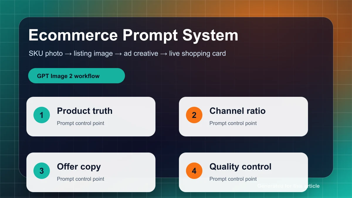
一套面向电商团队的 GPT Image 2 实战流程:从 SKU 简报到商品主图、广告变体、直播卡片和上线质检,帮助每个商品稳定产出可用素材。
电商图最重要的不是“好看”,而是让用户相信这就是他们会收到的商品,同时让运营团队能稳定复制这一套出图流程。

先把 SKU 简报写成唯一事实来源
不要一开始就写“生成高级商品图”。先用 8 个字段锁定商品事实:SKU 名称、品类、真实材质、颜色、包装角度、必须保留的 logo/标签位置、目标渠道、禁止改变的细节。这个简报是后续所有提示词的输入,不能让每个设计师或运营临场改写。
最实用的写法是把商品分成“不可变事实”和“可变呈现”。不可变事实包括形状、容量、瓶盖、按键、屏幕、缝线、标签、图案和颜色;可变呈现包括背景、光线、场景、道具、标题留白和构图比例。AI 可以帮助你改呈现,但不能替你重新发明商品。
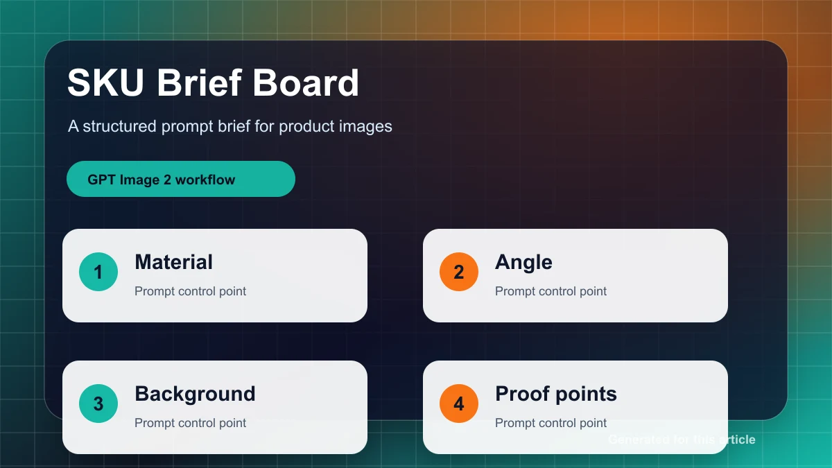
SKU brief
Product: [exact product name]
Fixed facts: [shape, color, material, label, packaging angle]
Audience: [buyer and buying context]
Channel: [marketplace listing / paid social / live shopping]
Do not change: [logo, text, button layout, unique product details]
Success check: the product is still recognizable when the image is reduced to 25% size.
商品主图:只优化呈现,不重写商品
商品主图的目标是“可检查”。用户需要看清轮廓、材质、标签和比例,所以提示词要克制。不要堆满“cinematic、dramatic、luxury”等风格词;主图更需要真实接触阴影、干净背景、稳定角度和没有多余道具。
Create a clean ecommerce listing image from the reference product.
Keep the exact product shape, color, material, logo position, label placement, and packaging angle.
Use a white or very light neutral studio background with soft contact shadow.
Center the product, keep all edges sharp, and remove unrelated props.
Do not redesign the product, invent text, change the label, add extra variants, or alter the package.
Output should be ready for a product listing page.
如果第一版过度“创意化”,不要继续加风格词,而是收紧约束:更少道具、更浅背景、更正的角度、更大的商品占比。主图不是广告,越稳定越值钱。
广告变体:一张商品图拆成四种投放角度
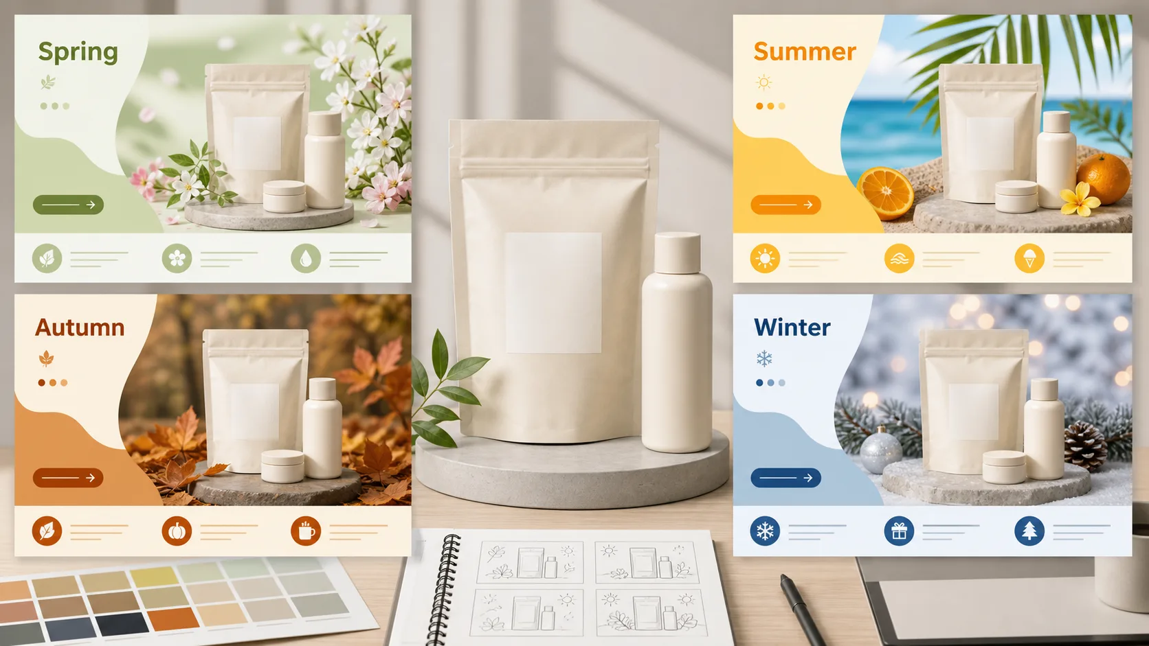
广告图可以更大胆,但仍然要让商品成为主角。建议把同一个 SKU 拆成四个广告矩阵:痛点解决、生活方式、促销优惠、对比证明。四种图只改变场景和信息层级,不改变商品。
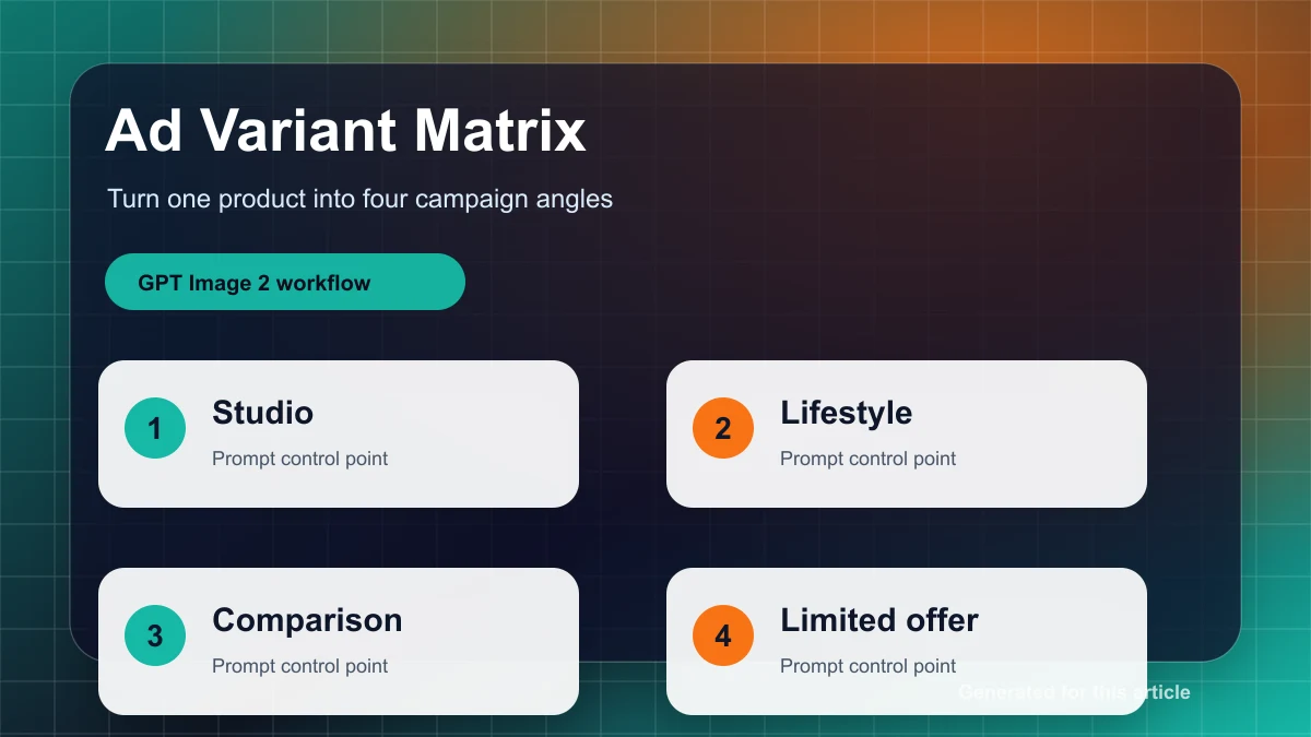
Create a paid social ad creative for [product] aimed at [buyer].
Preserve the product exactly as the reference.
Campaign angle: [problem-solution / lifestyle / limited-time offer / comparison].
Scene: [specific buying moment or use case].
Leave clean negative space on [left/right/top] for a short headline and offer badge.
Use commercial lighting, a clear product silhouette, and high contrast for mobile feeds.
Avoid fake logos, random text, extra products, unreadable labels, and clutter.
评估广告图时只看三件事:缩小后商品是否能认出;标题留白是否足够;用户是否能在 2 秒内看懂卖点。达不到就不是“再修漂亮一点”,而是回到布局和目标用户重写。
直播带货卡片:先照顾手机小屏
直播卡片比广告图更“粗暴”:商品要大,背景要简单,价格和时间区域要清楚。很多 AI 图在桌面看很好,一缩到手机直播间入口就失效。直播素材要优先保证移动端识别,而不是追求复杂布景。
Create a live shopping product card for [product].
Make the product large, bright, and easy to recognize on a phone screen.
Use an energetic retail background with simple shapes and high contrast.
Reserve a clean text zone for price, time, and one call to action.
Keep the product true to the reference.
Avoid tiny text, complex patterns, extra SKUs, fake badges, and visual noise.
上线前质检清单
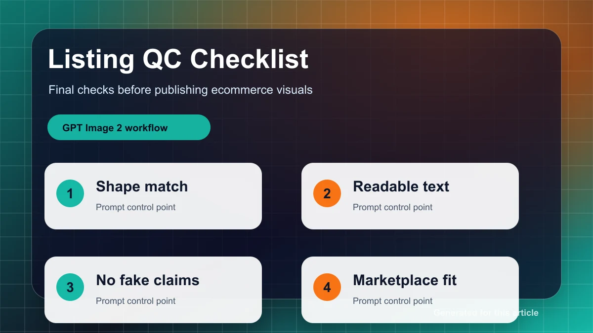
发布前逐项检查:商品形状是否和参考图一致;颜色是否偏离真实商品;标签、logo、按键和接口有没有被改;图片缩小后主体是否还能识别;是否有多余文字、假标签、奇怪道具;是否给标题、价格或 CTA 留了足够空间。
把通过质检的提示词保存成模板。下一次只替换 SKU brief、渠道和活动角度,不要整段重写。电商内容生产的效率来自稳定模板,而不是每次重新碰运气。
用 GPT Image 2 AI Online 把你的下一个 SKU 做成主图、广告图和直播卡片。